I haven't been working on too much around the house this past week. My little family has been spending a lot of time outside- enjoying our deck, enjoying our back and front yard, enjoying our basketball hoop, enjoying our subdivision, enjoying our home, enjoying each other, enjoying life. I am so very thankful.
Thursday, April 29, 2010
Friday, April 23, 2010
Welcoming Spring
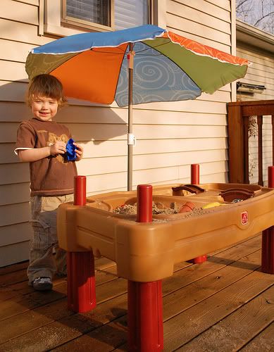
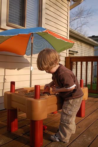
It has gotten increasingly nicer outside and as a result, we've been spending a lot of time on our back deck. Unfortunately it's pretty naked without any patio furniture or children's toys, so Clay and I bought a little something for the children to enjoy while playing outside.
A sandbox! The kids love it. Eventually I would like them to have a large sandbox (this can be a total diy project!) in our backyard where they can drive trucks around and build castles, but this is a great option until then.
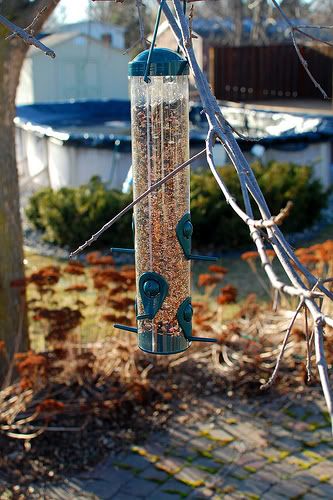
We also picked up a birdfeeder :)
Happy spring!
Sunday, April 18, 2010
Cupcake Lights, Good Enough to Eat
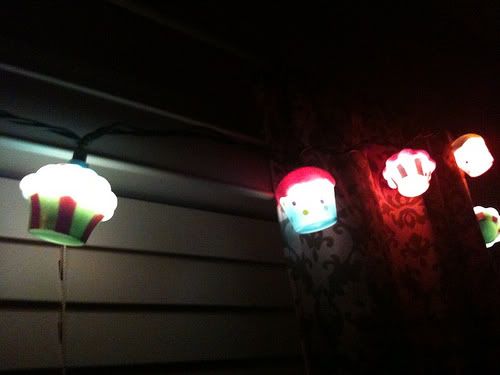
We had family visiting this past weekend who brought along a special gift for Emerson: cupcake lights for her nursery. They are now sweetly hung over her bedroom window and provide just the right amount of light at bedtime. Thank you Uncle Scott and Aunt Kelly!
Wednesday, April 14, 2010
Evolution of a Picture Frame Wall
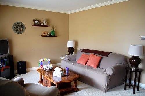
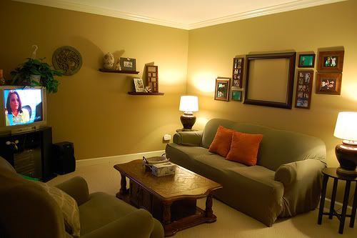
Here is the current state of our living room. Please try to ignore the mismatching handed-down furniture, as all this will be replaced when the budget allows. Focus more on the blank canvas above the couch.
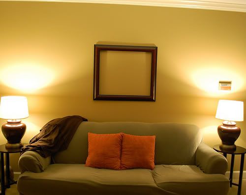
Here is the frame that I previously mentioned. We're planning on getting family pictures taken this fall and that will be the subject of this frame, so I know I want it above the couch.
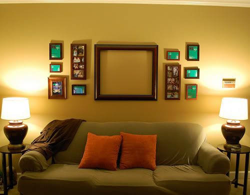
Using a mix of random frames we already had on hand (I'm trying to keep this project as inexpensive as possible), I created an arrangement that I initially liked. I kept it like this for a few days and surprisingly the balance of it appealed to me less and less.
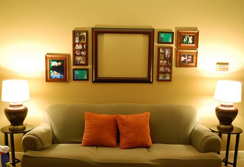
So I took out a few of the smaller frames and replaced them a with a couple larger ones and created a more asymmetrical layout. I think this one is much more pleasing and interesting to look at.
I then lowered the shelves on the other wall so everything would kind of flow into each other. The effect is much nicer. Now to actually fill the frames.
Sunday, April 11, 2010
Displaying Pictures and Frames
I found the most amazing deal on a 20x24 inch picture frame while at Michael's yesterday. Although it was only the frame, no glass and no picture, I couldn't pass on its $12 price tag. So I've been reviewing some of my favorite frame displays for some inspiration.
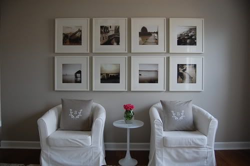
I love the preciseness and balance of this display.
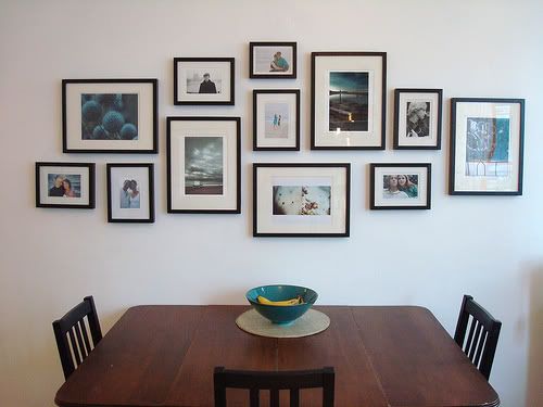
This display is gorgeous with its balanced disarray. And it's nice how all pictures have similar tones and are showcased with the same matting style.
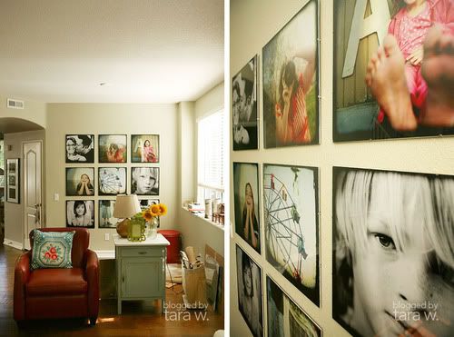
This is just absolutely lovely and fun.
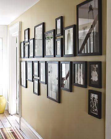
I like both the contrast of the frames against the wall and the dividing line between the top and bottom row of pictures.
Such great inspiration! I'm excited to get my frame hung and start my own picture collection on our living room wall.
Thursday, April 8, 2010
Easter Eggs
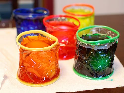
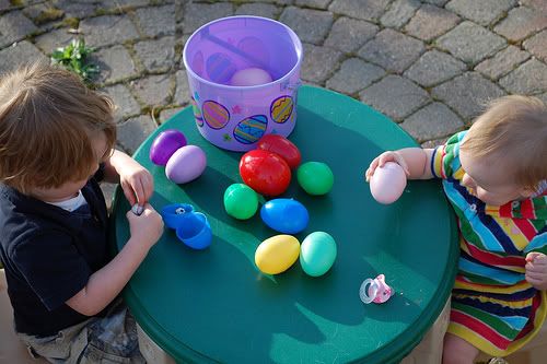
Our first Easter in our home was very sweet. We colored eggs which Narls throughly enjoyed and Clay and I hit trinket-filled plastic eggs in our backyard for the kiddos to hunt. The weather was beautiful, so both children sat on their tiny chairs at their little table and inspected their treasures.
I hope yours was just as sweet.
Saturday, April 3, 2010
Friday, April 2, 2010
The Bathroom, Revealed
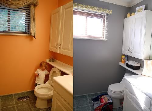
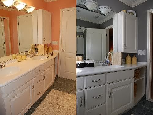
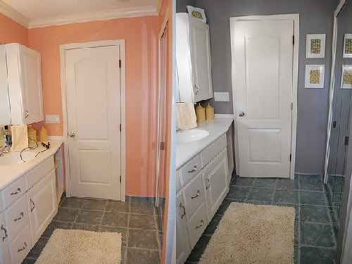
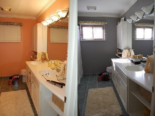
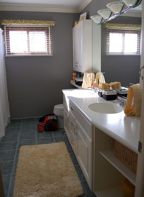
It is amazing what the right paint color can do for a room.
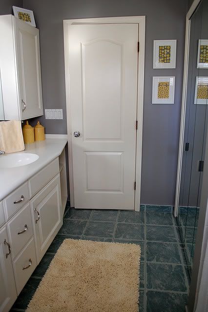
I had a couple people try to dissuade me from having the bathroom walls painted a steely gray (Sherwin Williams' Pewter Cast), coughcough*like my brother*coughcough, because "they" thought the room would be too dark and dreary. And I imagine that is the case in many rooms. Thankfully this space has the right amount of incoming light from east-facing window and it contains a great abundance of "white" from the cabinets, the closet doors and the main door both of which help offset the paint's coolness.
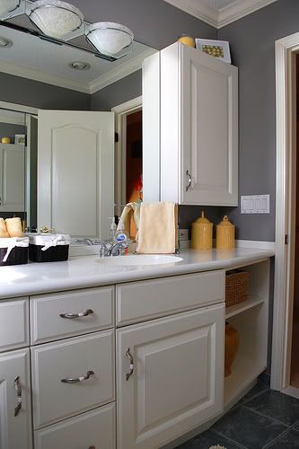
Plus I think the gray walls look perfect with all of the silver touches the room already contains, like the faucets, the cabinet handles and the detailing on the light fixtures.
I added pops of yellow throughout the room with the rug, a large vase, canisters that house q-tips and cotton balls, candles and hand towels.
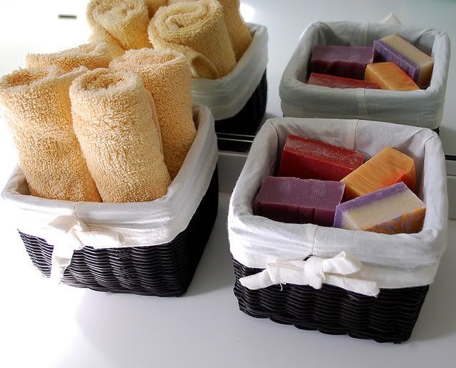
I cozied up some the open space on the counter with baskets holding additional hand towels and some homemade soaps in delicious scents like Sangria and Citrus.
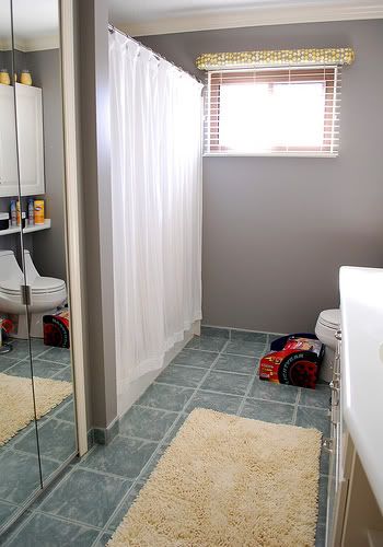
I decided on a white shower curtain instead of a patterned one, mainly because I liked the simpleness of it. Plus it gave me the opportunity of adding patterns elsewhere, such as in the window treatments and the art. Also, I thought the slight ruffled texture of the shower curtain provided the right touch of sweetness to the coolness of the walls.
The curtains I made myself by using a coordinating Amy Butler fabric and following the same design as the previous window treatments.
The "art" is also diy, simply by matting and framing pieces of fabric.
Another finished room that I am so very proud of. I spend a lot of time thinking about which colors will work in each space (it was especially tough in the bathroom because of the bluish tiled floor), how those colors will flow with the house, how the style reflects my family's personality and of course convincing Clay that our money will be best spent updating the space. And speaking of a budget, I try and do as much of the decorating myself (I love a good diy project) and scoping out the best deals on items by shopping at budget stores like TJ Maxx, Target and second-hand shops. The payoff is so very worth it; this space is now much more modern and a lot more "us".
Thursday, April 1, 2010
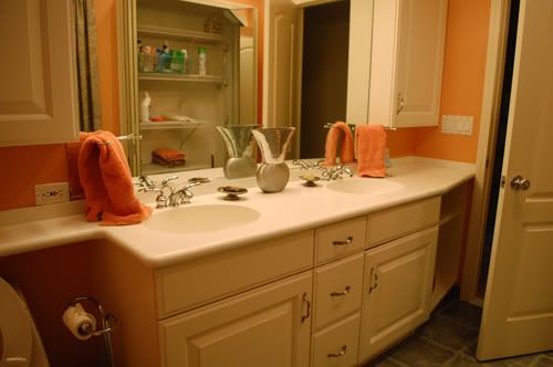
The Bathroom, Before
I am so excited to share our finished bathroom with you, but staying true to tradition, I will show you what we started with first.
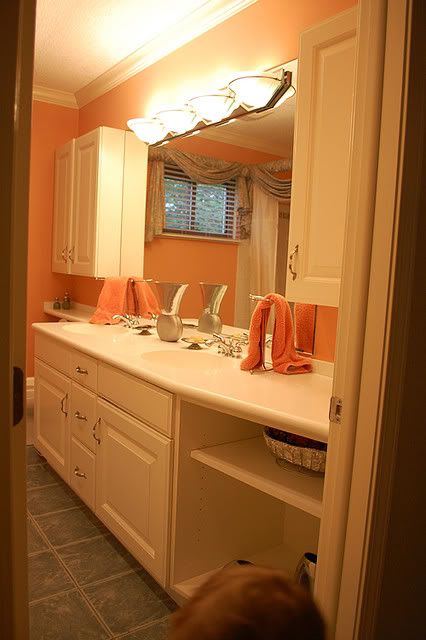
Gorgeous cabinets and counter tops and I LOVE the huge mirror.
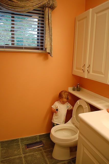
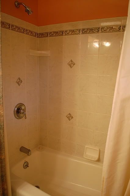
I don't love the salmon-colored walls though.
Nor is the ornate drapery (that matches the shower curtain, which
unfortunately I didn't get a picture of) our style.
I was wrong; I did get a bit of the shower curtain pictured there on the
left. It framed the entire shower in the same manner the drapery framed
the window. Pretty fancy, huh?
Subscribe to:
Comments (Atom)

