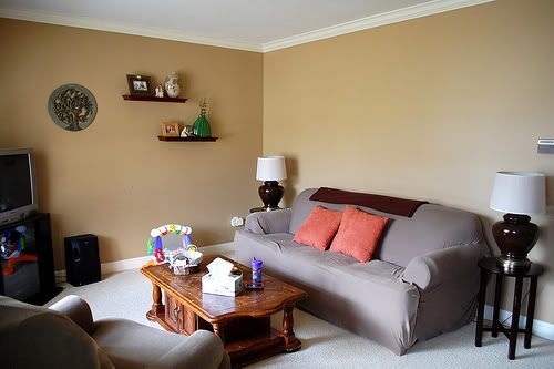
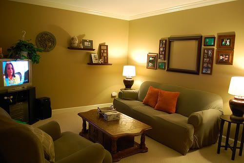
Here is the current state of our living room. Please try to ignore the mismatching handed-down furniture, as all this will be replaced when the budget allows. Focus more on the blank canvas above the couch.
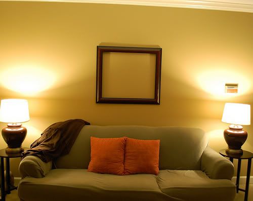
Here is the frame that I previously mentioned. We're planning on getting family pictures taken this fall and that will be the subject of this frame, so I know I want it above the couch.
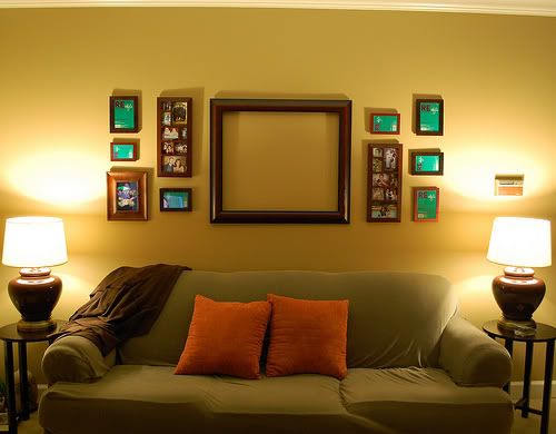
Using a mix of random frames we already had on hand (I'm trying to keep this project as inexpensive as possible), I created an arrangement that I initially liked. I kept it like this for a few days and surprisingly the balance of it appealed to me less and less.
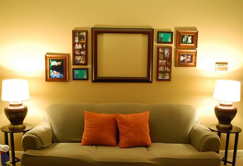
So I took out a few of the smaller frames and replaced them a with a couple larger ones and created a more asymmetrical layout. I think this one is much more pleasing and interesting to look at.
I then lowered the shelves on the other wall so everything would kind of flow into each other. The effect is much nicer. Now to actually fill the frames.



0 comments:
Post a Comment